TD App Redesign
Type: UX/UI Design, Information Architecture, Research
Role: Lead Designer, Researcher, Graphic Designer
The challenge
How can we assist our clients in spending and saving their money responsibly?
Helping users spend and save their money responsibly
Our bank accounts are usually organized by our main accounts (savings and chequing) and credit cards but they do not offer any ways of tracking how much you’ve spent on a specific aspect of your life, or an analysis of how you’re spending your money this year compared to previous years. This lack of analysis may make us vulnerable and end up spending more money than we need to on unnecessary things.
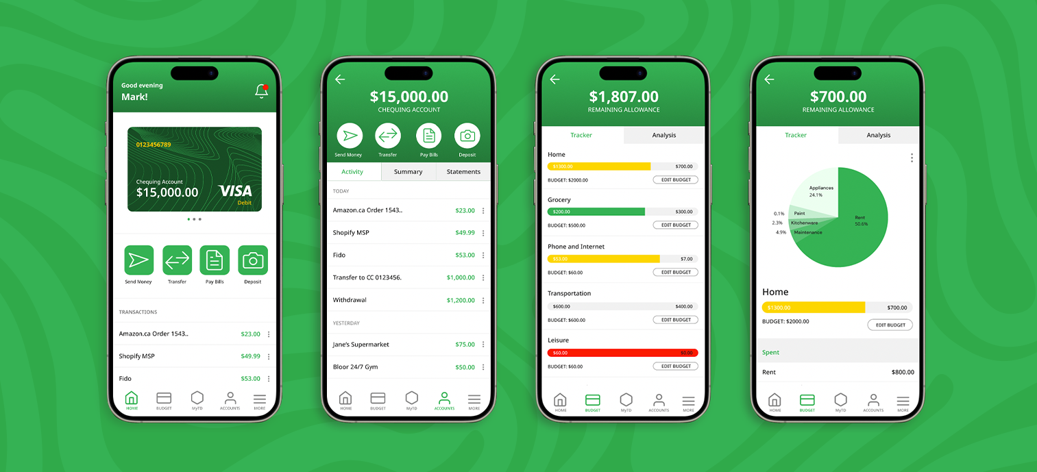
The solution
The solution we are proposing is a feature that tracks your monthly budget, organized by categories like Home, Transportation, Leisure or any other category you need. An analysis section is also included to analyze your annual and monthly spending habits. This feature will be one of the main items on the footer menu as a constant reminder spending and saving your money responsibly.

How it affects your existing chequing and savings account
The budget tracker and analysis tab is not a traditional bank account. It is a separate budget and spending tracker within the app. What makes this unique from the other budget tracking app is that users can directly subtract their spending from a budget category. Here’s an example:

Information architecture
Site map

User flow
Task 1: User 1 wants to analyze how much they’ve spent this month.


Task 2: User 2 wants to know the operating hours of the first stop of Tour 1 - the Royal Ontario Museum.
Branding
The app uses the typeface Noto Sans due to its ease of use, versatility and amazing design. The app needs to be on the point and not distract from the design and the vision.
The TD green is heavily featured on the app along with a darker shade - forest green to give it some contract. We used the HEX #1E1E1E because it’s easy on the eyes and not very harsh on the white background. We also use a lot of grey to separate some of the sections.
Typeface


Color palette
#35B254
R53 G178 B84
C76 M1 Y93 K0
#1E1E1E
R30 G30 B30
C77 M66 Y65 K75
#174C24
R23 G76 B36
C86 M42 Y100 K46
#868686
R134 G134 B134
C50 M41 Y41 K5
#F1F1F1
R241 G241 B241
C4 M3 Y3 K0
#FFFFFF
R255 G255 B255
C0 M0 Y0 K0