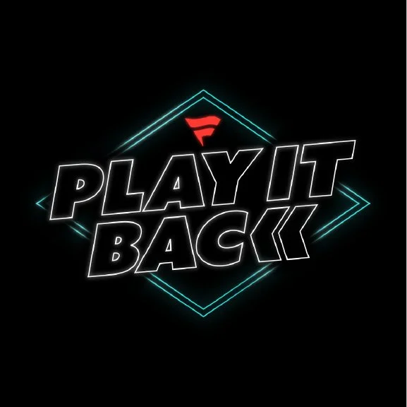
Fanatics: Play It Back
Visual Identity Concept
Role
Creative Director, Designer
Tools
Adobe Creative Suite, Procreate
Clients
Fanatics
Year
2026
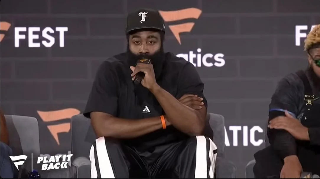
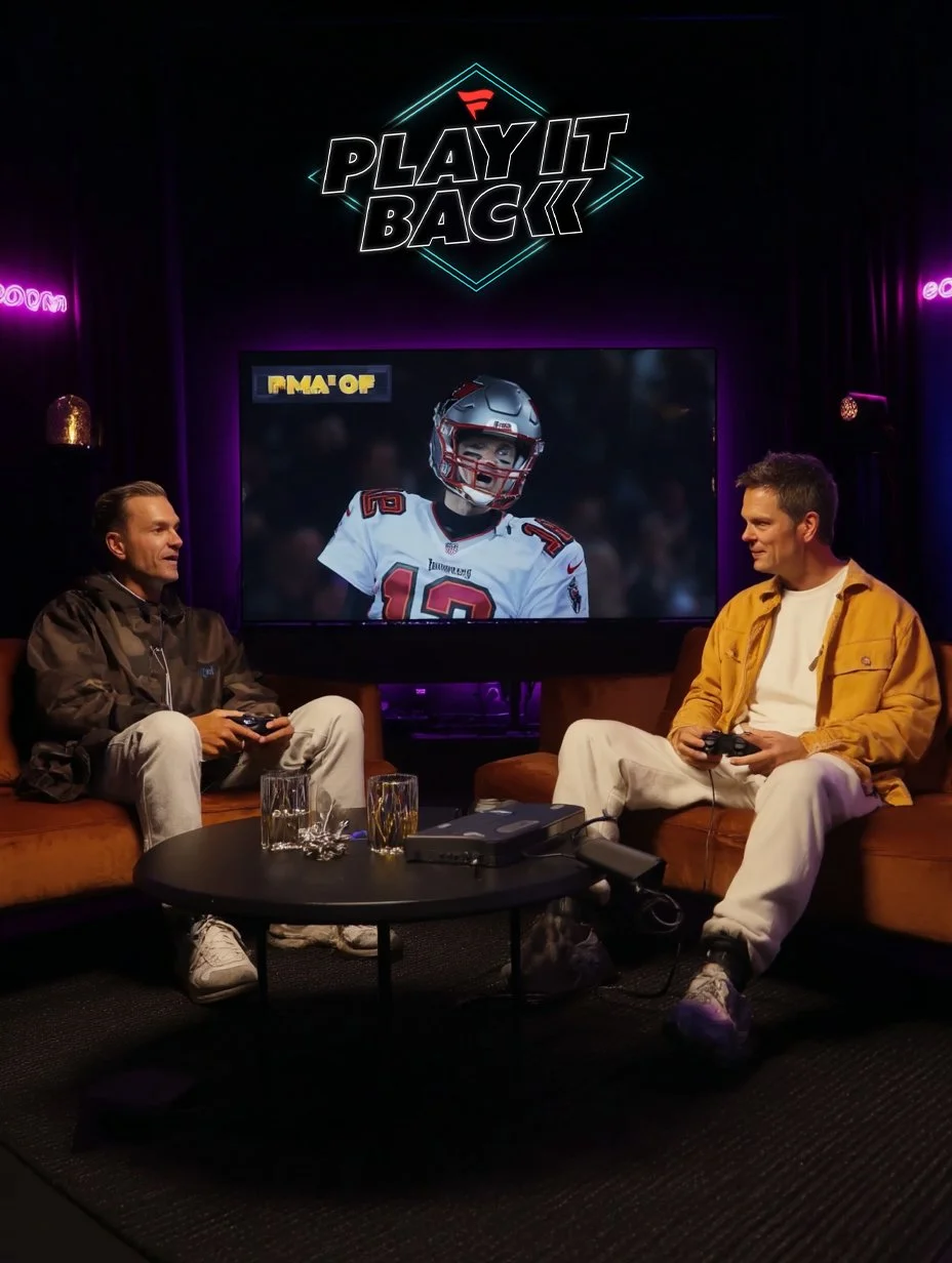
I was invited by the Fanatics creative team to develop a branding system for their new YouTube series, Play It Back. The show’s premise is a unique intersection of sports and nostalgia: athletes and media personalities sit down for an interview while playing a video game released the year they were drafted.
My approach focused on bridging the gap between modern sports broadcast aesthetics and retro gaming culture. While this direction wasn't selected for the final production, I’m incredibly proud of the visual language I built for the pitch. This project represents a deep dive into era-specific nostalgia and brand storytelling.
THE VISION
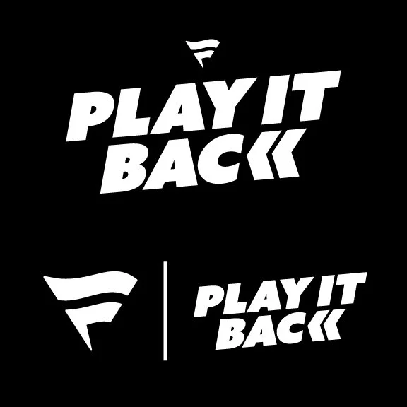
I wanted to create something that was simple, direct, and visually distinctive, while feeling like a natural extension of the Fanatics brand rather than something that competes with it. The goal was to design a logo that stands confidently on its own, but also works seamlessly when placed alongside the Fanatics logo—balanced in presence, scale, and tone.
From the beginning, I focused on clarity and recognizability, stripping away anything unnecessary to arrive at a mark that feels modern, versatile, and easy to apply across different platforms. The visual language pulls from a mix of video games, tech iconography, movies, and sports—references that help ground the logo in entertainment and athletic culture while keeping it contemporary.
By blending these influences, the final design feels familiar yet fresh, with a bold, graphic quality that translates well across digital, broadcast, and social environments. Overall, the logo is designed to be functional, adaptable, and memorable, supporting the brand’s identity without overpowering it.
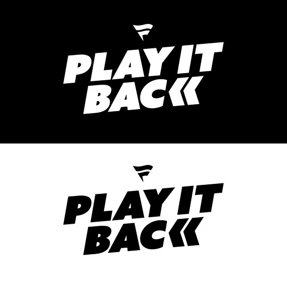
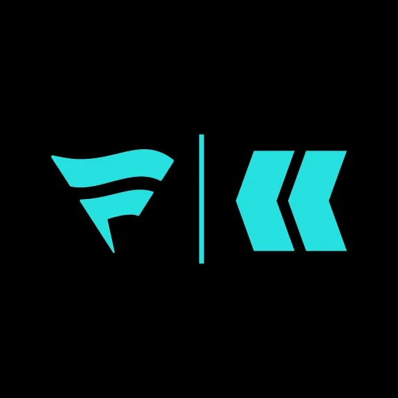
WORDMARK
Inspired by sports logos, the mark is bold, timeless, and versatile, with a strong presence that stands on its own without competing with the Fanatics logo.
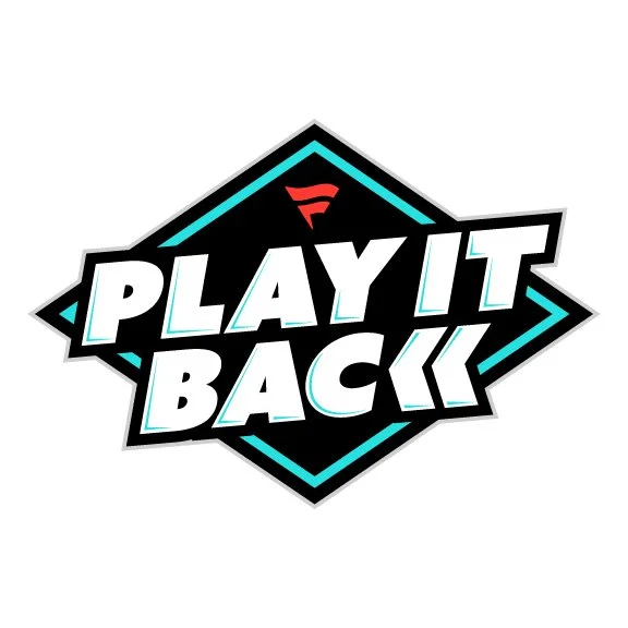
DIAMOND
It echoes classic sports badge and crest shapes, giving the logo a bold presence that feels at home alongside Fanatics’ brand without competing with it. It frames the wordmark like a badge of honor — earned through achievement.
COLORWAY
Vibrant, eye-catching, and approachable—the teal draws inspiration from retro video games and synthwave aesthetics, while red keeps the palette grounded in Fanatics’ brand. Black and white provide a timeless foundation.
ANGLE
Drawing inspiration from sports logos, the angled wordmark suggests motion and momentum. It represents going back in time to relive the past—while using those moments to keep moving forward.
ICON
The rewind button replaces the “K,” a small but intentional change that significantly transforms the logo. This single icon elevates the mark from a simple wordmark into something distinctive and instantly recognizable—unique to Fanatics.
WORDMARK
The wordmark is designed to stand confidently on its own — bold, highly legible across any background, and versatile enough to scale seamlessly into motion and animation.
ICON
The icon is designed to give the show another identity. Based on the rewind button - this icon stands on its own and has potential to be used on its own when the show has gained enough popularity.
COLORWAY
Vibrant, eye-catching, and approachable—the teal draws inspiration from retro video games and synthwave aesthetics, while red keeps the palette grounded in Fanatics’ brand. Black and white provide a timeless foundation. Grey is a neutral color that holds everything together.
R0 G0 B0
C100 M100 Y100 K100
#000000
R255 G255 B255
C0 M0 Y0 K0
#FFFFFF
R38 G234 B224
C59 M0 Y21 K0
#26E0E0
R255 G57 B50
C0 M91 Y84 K0
#FF3932
R206 G206 B206
C18 M14 Y15 K0
#CECECE

ADDITIONAL LOGO TREATMENT
This idea was part of the original design thinking. Although shown as a static graphic, the concept was imagined in motion — drawing inspiration from light beams and fluorescent lighting — to highlight the flexibility and potential for multiple visual treatments.
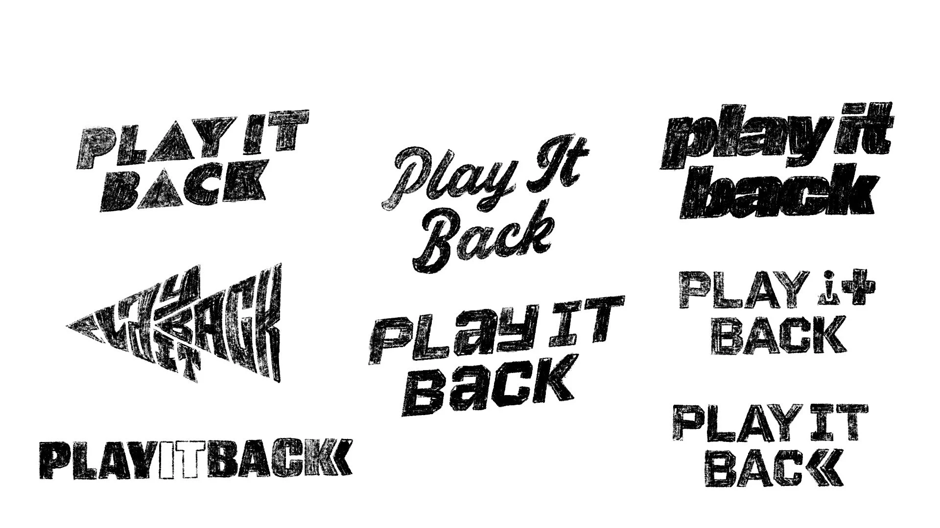
ROUGH DRAFTS